| If this message is not displayed properly, click here to launch your browser |
 |
 |
Newsletter
May 24, 2013 |
 |
Issue
1
|
 |
|
|
|
 |
Partial to pink? Good news: ESP Presentations allows you to create custom presentations using a wide variety of color, theme and layout combinations. You literally have hundreds of ways to create a winning presentation. But before you design your next one, keep this in mind: Your presentation is an extension of a brand. So you’ll want to make sure it has a similar look and feel to your other marketing materials. For instance, if your website has an electric blue background and edgy graphics, design your presentation to match that look. And here’s a great time-saver: Presentation themes, data fields, and opening and closing pages all can be set to a default so that you don’t have to reinvent the wheel every time you create a new presentation. In addition, if you have an ESP Website, you’ll find a template to match in our library!
Click here for more tips on selecting a design template in ESP Presentations that works for you. |
 |

Good, Better, Best
It’s a classic way to upsell clients: Present them with a good, better, best scenario when showing them products to use in their promotions. For example, if you’re showing them blue mugs, feature one that’s a little bit under or within their budget, and two other costlier options that might be a bit of a stretch. Often, clients are willing to dig deeper into their pockets if they see something that’s of higher quality.
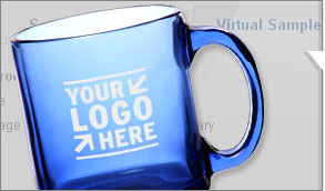
Another tip: Be sure to use ESP Presentations’ virtual sample tool to apply a client’s logo to the products in your presentation. Clients are naturally more interested in a product if they can see how it’s going to look with their branding on it. With one click of a button inside the ESP Presentations tool, you can apply a virtual logo on all products within ESP® that are virtual sample-enabled.
Click here for a tutorial on how to create virtual samples for your presentation. |
 |
 |
 |
|
A Better Way to Search
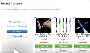
When selecting products to include in your ESP Presentation, here’s a little secret: ESP now has a “Product Compare” feature which allows you to quickly compare an unlimited number of products from over 3,200 options, side by side. It’s a quick way to contrast similar products’ features, like color, imprint area and price, to make sure that you’re selecting the best ones for your clients. When presenting a number of product options in your ESP Presentation, be sure to point out the unique features of each and explain why you think each would be ideal for your client’s program. |
Before You Hit ‘Send’ …
Your ESP Presentation is complete and ready to be sent to a client or hot prospect. Congratulations! But don’t hit ‘send’ yet. Make sure that you’ve given the recipient a reason to act quickly. For instance, you might offer a timed incentive like special pricing (i.e. “I’m able to offer you a five percent discount if you place your order within the next 10 days”) to encourage a rapid response.
Once your presentation is complete, you can e-mail it as an HTML file or a PDF. You can also easily share it by publishing it to your ESP Website™ or Company Store. |
 |
 |
|
|
 |
|
 |
 |
© 2013, Advertising Specialty Institute®. All Rights Reserved. |
|